What Does Your Money Pie Look Like?
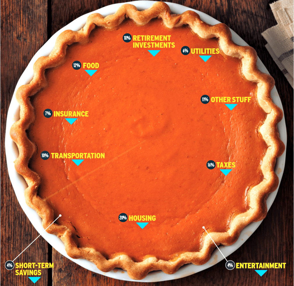
I remember getting a magazine from USAA back in 2012 with this depiction of a money pie. It breaks down a suggestion by certified financial planner on how we should ideally be allocating your money. I really liked the idea of this conceptually that our money is a pie we splice up. I think it is essential to know where you money is going. As an exercise, I used numbers I already had from my monthly expenses to display what percentage of money was going into each category. Do you know what your money pie looks like?
Expense vs Income Breakout Template
I don’t exactly use all the categories depicted in image. For example, I don’t include taxes nor retirement investments. I kind of did this because some of this was taken out of my check prior to me receiving or included in payments. So, this can be used for you too to analyze are your percentages where you want them to be. Calculate each category by summing all spending on transactions in that category for the month. Then, divide that sum by your total monthly net income (take home pay) to come up with the percentage spent in that category.
For example, Netflix is $12.98 and a night at Dave & Buster’s is $80. I would list these expenses under entertainment category. If this was my only spending in this category for the month, I would sum ($12.98 + $80 = $92.98). Then, if my net monthly income is $3500, the math is ($92.98 ÷ $3500) × 100 = 2.6%. This means 2.6% of my income goes to entertainment each month. Repeat this for each category and you can see what percentage of your income is going to each of those categories or categories you create.
Breakdown Exercise
When doing the below exercise, is your breakout what you expect? Can you make improvements? The disposable income category is what I want to see be high. It is exactly that measure that shows after expenses how good you are doing and you can direct that money wherever you like. It could be additional investments, travel and entertainment, services, etc.
Here was my breakdown by category:
- Entertainment – 0.45%
- Food – 6.3%
- Housing – 32%
- Insurance – 27%
- Transportation – 6.7%
- Utilities – 5.6%
- Miscellaneous – 7.11%
- Disposable Income – 14.84%
The summation of these categories should be approximately 100%. If greater than 100%, it means you are spending more than you make on a monthly basis and are probably in debt.
In Closing
People sometimes hate hearing the term budget, perhaps it’s easier to think in terms of a nice sweet pie. Despite, maybe, not having a formal budget, your informal budget is income constrained and it gets sliced up like a pie. We can either consciously divide up that pie or have it divided for us. The former being more ideal, the exercise above helps us start to see where our money is going. In addition, the more aware we are, the better we can direct our income where we want it to go. Find out what you money pie looks like and post the breakdown in the comments below.


